Exposure to Art: a MTA Case Study
Many corporations and agencies allocate a certain amount of their budget towards the creation of public artwork. For instance, New York’s Metropolitan Transportation Authority (MTA) has funded nearly 300 permanent art installations since 1982 under the city’s “Percent for Art” law. If we question the effectiveness of the program, we immediately run into problems of measuring the subjective aesthetic value of the creations. However, we may measure their effectiveness by a necessary quality of input: the extent of MTA travellers exposed to art. We propose a “weighted proximity” metric as a performance indicator and, using NY Open Data, evaluate their scoring as of 1990, 2000, 2010, and 2020. We find the MTA has been increasing the extent of the traveling population exposed to public art each decade, although the rate of increase has dropped over time and many installations “reinforce” already existing, nearby art installations. We provide a ranked list of 20 sites which, through new art installations, will yield the greatest increase in our weighted proximity metric and find that three of the sites already have art installations since 2021, signaling continued improvement.
Background
Public art is “work created by artists for places accessible to and used by the public” (Backer 2004). The “for places” in the definition is key, as public art is contrasted to “art in public,” where the art was not created specifically for the given site. Further, although an art gallery may be accessible at no cost, the “place” is normally a broader public space such as a park, thoroughfare, train station, library, or bridge.
As of 2004, the United States has over 350 public art programs supporting thousands of artist’s projects. Eighty-one percent of these programs are controlled within a public agency (Backer 2004). Funding for these projects typically comes from a “percent for art” law which allocates a certain percentage of the construction cost to artwork. The funding agency often influences the art’s subject matter and the designated site will impose certain restrictions or inspirations. For example, a recent prospectus for public art at the Roosevelt Science Center in New Mexico specifies the art will be two-dimensional, fit within certain specified areas of the building, and feature a theme that reflects the “nature of the building’s science-focused focus.” Artwork for the public in motion may carry safety requirements, such as not distracting drivers (Wilkerson 2009).
Since public art is usually publicly funded, represents an increase to the cost of construction or rehabilitation, and sometimes controversial, defenders have argued for the benefits of public art. (Backer 2004) summarizes the benefits using four categories: 1) civic dialogue and community engagement 2) increased attention and economic activity 3) connection of artists with communities and 4) enhancement of public appreciation of art. A more recent survey by (Cheung 2022) categorized benefits along eight themes: Placemaking, Society, Culture, Economy, Sustainability, Wellbeing, Wisdom, and Innovation.
Although many of these stated benefits are qualitative, we believe it is uncontroversial that the public is intended to be exposed to public art, so the choice of locations for public art should be influenced by where the public happens to be. The pairing of the public’s location and the art location is an input to the “attract attention and economic benefit” from the first survey and the “placemaking” and “wellbeing” benefits of the second survey above.
Weighted Proximity Score
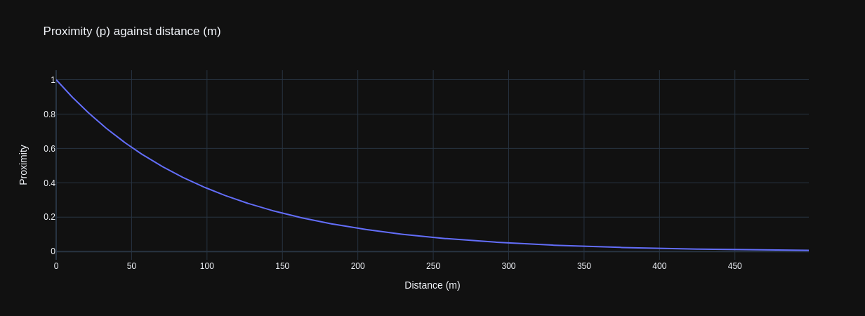
We model exposure to art by the proximity, p, of travellers to an art installation. p is defined as:
$$ p=e^{-d/100} $$
where d is the distance between an anchor point (e.g. a stop or station) and the art installation, in meters. Proximity is modeled as an exponential decay where approximately 2/3rds of the value is within the first 100 meters or one approximate city block. As travellers move beyond a city block, we model that the probability of their exposure to an art piece rapidly declines. Computationally, distances of 500m or more can be treated as zero to avoid numerical issues.
For a given anchor point, the aggregate proximity, P, is the clamped sum of p, or:
$$ P=min(\sum{p}, 1) $$
By clamping the value of P, this model implies that at some point there is “enough” art and installing more will not increase the value.
Since travellers do not visit anchor points with equal probability, we assign a weight, w, to each anchor based on the proportion of visits. For this study, we computed the weight as the sum of the average ridership estimate in 2023 based on the “MTA Subway Origin-Destination Ridership Estimate” data set divided by the total average ridership estimate. The product of P and w gives the weighted proximity score:
$$ P_w=Pw $$
MTA Performance, 1990 - 2020
The “MTA Permanent Art Catalog” lists art installations within their network. The first artwork is Masstransiscope, installed in 1980. Installations were slow to start but by 1990 we see a steady flow. (Note that we are treating each row in the catalog as an installation. However, the catalog has repeated instances when installations span multiple stops.)
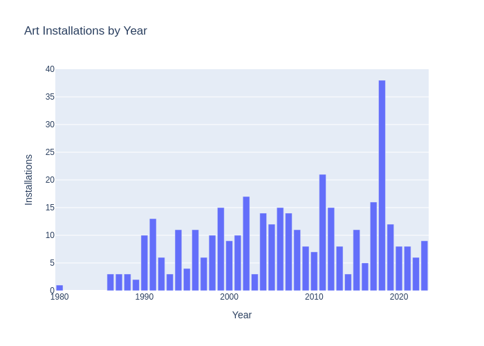
When we plot art installations by location, grouped by decade, we see the definite shape of the transit network becoming visible as art is installed.
 |
 |
 |
 |
Although some art is installed along a transit line, the majority of pieces are located within a subway station, near a stop, or near an MTA complex. Calculating the proximity score for each complex (using the list of complexes from the 2023 Origin-Destination dataset), we see that each decade has seen a strong decline in the number of sites with effectively zero proximity to art, from 94% in 1990 to 38% in 2020. The mean p score has increased from 0.05 in 1990 to 0.64 in 2020.
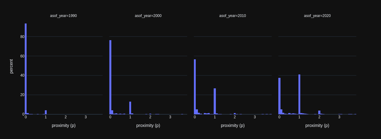
| As of Year | Mean Proximity (p) Score |
|---|---|
| 1990 | 0.05 |
| 2000 | 0.20 |
| 2010 | 0.41 |
| 2020 | 0.64 |
To weight the locations by population, we use the MTA’s Origin Destination dataset and sum each location’s weight by each origin destination pair’s average ridership data. To validate this approach, we compare MTA’s summary of 2023 ridership by our weights. The proportion of ridership of each location versus the 10th ranked position has good alignment.
| Rank | Station/complex | Ridership | Ridership vs. 10th | Raw Weight | Raw Weight vs. 10th |
|---|---|---|---|---|---|
| 1 | Times Sq-42 St/Port Authority Bus Terminal | 54,266,441 | 3.91 | 19,703,290 | 3.12 |
| 2 | Grand Central-42 St | 30,517,475 | 2.20 | 13,926,937 | 2.21 |
| 3 | 34 St-Herald Sq | 23,680,977 | 1.71 | 11,000,955 | 1.74 |
| 4 | 14 St-Union Sq | 21,527,757 | 1.55 | 10,301,633 | 1.63 |
| 4 | Fulton St | 17,887,203 | 1.29 | 8,325,765 | 1.32 |
| 6 | 34 St-Penn Station | 16,974,543 | 1.22 | 7,652,911 | 1.21 |
| 7 | 59 St-Columbus Circle | 15,842,348 | 1.14 | 7,506,844 | 1.19 |
| 8 | 34 St-Penn Station | 15,224,047 | 1.10 | 6,914,365 | 1.10 |
| 9 | Jackson Hts-Roosevelt Av/74 St-Broadway | 14,348,691 | 1.03 | 6,555,554 | 1.04 |
| 10 | Flushing-Main St | 13,876,213 | 1.00 | 6,310,435 | 1.00 |
Weights decline rapidly and the median weight is 732,000. Half of the ridership is accounted for in the top 63 (of 425) sites. When we plot the locations and color them based on their weight, we can see most locations have a dark blue/purple value. Thus, per normal power law relations, a significant percentage of travellers can be exposed to art with art installations at a fraction of stations.
Using these weights and using the proximity scores for each site by decade, we can calculate the weighted proximity, or \(P_w\) value, for each site. Grouping them by decade, we calculate:
| As of Year | Mean Weighted Proximity (\(P_w\)) Score |
|---|---|
| 1990 | 0.0002 |
| 2000 | 0.0007 |
| 2010 | 0.0012 |
| 2020 | 0.0014 |
Public exposure to art, as measured by \(P_w\), has increased every decade, but the marginal increase has slowed. Using the 2020 data (see table below), about half of the weight of travellers has a p score greater than 0.8, indicating close proximity to public art. A quarter of the weight have some public art within 500m, but more than 25m. The last quarter are more than 500m from public art.
| Criteria | # of Sites (2020) | % of Weight |
|---|---|---|
| p > 1 | 94 | 31 |
| p > 0.8 | 220 | 53 |
| 0.8 > p > 0 | 74 | 25 |
| p = 0 | 131 | 22 |
The slowdown in the increase may be attributed to some sites hosting multiple art pieces. There are 94 sites with more than one public artwork. This model limits P to at most one maximal proximity piece, so having two pieces in close proximity does not double the exposure.
Highest Impact Locations by 2030
If the MTA wished to increase their \(P_w\) score for 2030, they should install art within sites with the highest remaining impact, namely sites without existing art but a high weight. (We are assuming no artwork will be removed from an existing site.)
Comparison to MTA’s 2021-2023 Art Installations
The MTA permanent art catalog lists 23 installations between 2021 and 2023 (below). Some of these sites, such as the two Mount Vernon bridges and the Roosevelt Island Ventilation Structure (“Double Take”), represent installations visible along transit, versus installed at a stop. Note that the model does not include any anchor points along the transit routes, so the model does not value installations of this type.
| Agency | 2021-2023 Installation Site |
|---|---|
| NYCT | 86 St |
| NYCT | 138 St-Grand Concourse |
| Metro-North | Port Jervis |
| Metro-North | Mount Vernon 3rd Avenue Bridge |
| NYCT | 1 Av |
| NYCT | Bedford Av |
| Metro-North | Mount Vernon 10th Avenue Bridge |
| LIRR | New Hyde Park |
| LIRR | Westbury |
| NYCT | Tremont Av |
| LIRR | Grand Central Madison |
| NYCT | Times Sq-42 St |
| LIRR | Elmont-UBS Arena |
| LIRR | Grand Central Madison |
| NYCT | 181 St |
| NYCT | Lorimer St |
| NYCT | 7 Av |
| NYCT | 34 St-Penn Station |
| LIRR | Roosevelt Island Ventilation Structure |
| LIRR | Mineola |
| NYCT | Grand St |
| NYCT | E 149 St |
| SIR | New Dorp |
Based on a stop/complex’s weight and the lack of public art in the proximity, we can rank the top 20 sites where the addition of public art will yield the greatest increase in MTA’s \(P_w\) score. Of this list, the MTA has installed art since 2020 at three of the twenty locations. (As of this writing, the data does not cover 2024 or later.)
| Complex ID | Recommended Site | Art Installation Since 2020? |
|---|---|---|
| 120 | Bedford Av (L) | Yes |
| 451 | Junction Blvd (7) | |
| 450 | 103 St-Corona Plaza (7) | |
| 231 | Grand St (B,D) | Yes |
| 119 | 1 Av (L) | Yes |
| 261 | Forest Hills-71 Av (E,F,M,R) | |
| 153 | 125 St (A,C,B,D) | |
| 605 | 168 St (A,C,1) | |
| 259 | Kew Gardens-Union Tpke (E,F) | |
| 151 | 145 St (A,C,B,D) | |
| 165 | 23 St (C,E) | |
| 452 | 90 St-Elmhurst Av (7) | |
| 232 | 2 Av (F) | |
| 51 | Kings Hwy (B,Q) | |
| 264 | Woodhaven Blvd (M,R) | |
| 35 | 59 St (N,R) | |
| 254 | Jamaica-179 St (F) | |
| 265 | Grand Av-Newtown (M,R) | |
| 234 | East Broadway (F) | |
| 312 | 79 St (1) |
Note that this list is based solely on proximity to MTA’s permanent artworks and the number of passengers; some sites may not be appropriate locations for art due to legal restrictions, lack of percent funding, physical restrictions, or prominent non-MTA artwork.
Limitations of Approach and Data
This study’s effectiveness is limited by both elements of the approach and of the data. First, our identification of art locations is based solely on the MTA’s permanent art catalog and our semi-manual mapping to latitudes and longitudes. This catalog is not inclusive of the range of MTA’s artwork; MTA’s Art & Design program also includes digital art, photography exhibitions, posters, poetry, and live music. These latter forms may not necessarily fulfill the definition of “public art,” rather often being “art in public,” but the public is being exposed to forms of art. It is up to the viewer how much stress should be placed on “public art” versus “art in public.” MTA travellers will also be exposed to art along transit lines and directly outside stops that are not controlled by the MTA and thus not catalogued. Ideally, the MTA should not be obliged to install artwork in an area already well-serviced by other parties.
The study’s method for weighting locations with passenger volumes is based on a data source and an origin-destination model for 2023. Ideally, we would use historical passenger volumes when computing historical P values.
The correlation between proximity and exposure may be poor; it is certainly unmeasured. A traveller may not notice an artwork depending on the layout of the station and the flow of traffic. Over time, artwork may also blend into the background due to changes at the site or public familiarity. Temporary or rotating art may yield greater exposure due to its novelty. We expect a series of traveller surveys would illuminate what artwork is being seen and remembered by travellers.
Production Notes
We used DuckDB for the majority of the data analytics and Python for “glue” and specialized purposes. Visualizations were created using plotly.
Primary data sources used for this study:
Secondary data sources used for this study:
Art Locations
The MTA Permanent Art Catalog identifies the locations of artwork by agency, station name, and line. For the model, we need a latitude and longitude. To derive a latitude and longitude, we attempt to map the agency, station name, and line to a singular location through the secondary data sources. However, since station names and lines change, and are not always represented in a canonical form, this is a messy join process. The namemunging.py script describes the processing steps we took to create the “lookup.csv” file. The corrections.csv contains the manual corrections used to associate art with locations when the location metadata did not match any of the current locations.
Disclaimer
Although this study leveraged open data provided by the MTA and the New York government, the study was conducted independently of those parties.
References
(Backer 2004) Backer, Jack. 2004. “Public Art: An Essential Component of Creating Communities.” Americans for the Arts Monograph. Americans for the Arts. https://www.americansforthearts.org/by-program/reports-and-data/legislation-policy/naappd/monograph-public-art-an-essential-component-of-creating-communities.
(Cheung 2022) Cheung, Ming, Natasha Smith, and Owen Craven. 2022. “The Impacts of Public Art on Cities, Places and People’s Lives.” The Journal of Arts Management, Law, and Society 52 (1): 37–50. https://doi.org/10.1080/10632921.2021.1942361.
(Wilkerson 2009) Wilkerson, April. 2009. “What Becomes Public Art? How Oklahoma Officials Determine What Visually Impacts Locals, Newcomers.” Journal Record, September 8, 2009. Gale General OneFile.