Simplifying Logic
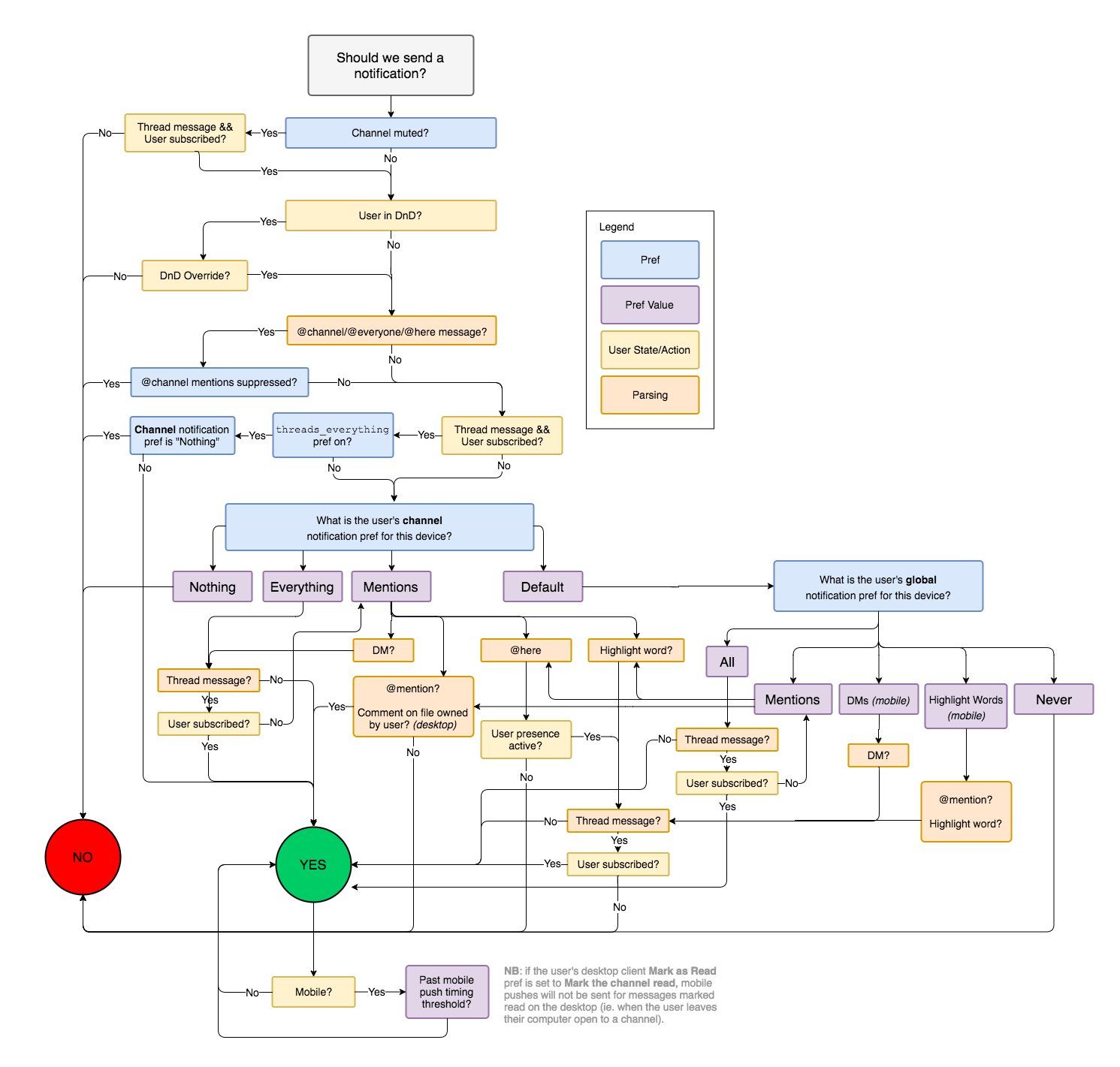
Slack’s business logic for showing notification periodically appears in LinkedIn posts and such. In Slack’s original post, this diagram was meant to illustrate what logic was being transferred from the multiple Slack clients to the server, but the diagram has since been taken as an example of product complexity and how development is harder than it may sound. In contrast, I think the diagram obscures the intended logic, but the logic itself is not complex. I’ll describe how to simplify it and where diagrams might not be the right approach to convey requirements.
The diagram in question:

First, some praise. The diagram is well laid out, with only a few cases of lines crossing each other. The text is succinct and largely clear. The representation is also compact and there’s good reason to believe the diagram is complete (at least at the time of publication1). I also appreciate the actual blog post; moving logic to the server tends to reduce bugs and improve velocity via re-use and eliminating duplication. Reducing memory footprint is also a user benefit. Finally, the post was not about the business logic itself, so the diagram comes to us without context.
The blog post describes the diagram as a “workflow diagram”, but since there is no work being described (e.g. fetching of data), only decisions, this is closer to a decision graph. (Some nodes are given multiple parents, so as written, this is not a tree, but it could be translated into one.) The graph has two terminal nodes, “Yes” and “No”, to represent whether a notification should be sent to the user on the running device. Other nodes represent a decision, mostly boolean, although some nodes have multiple enumerated values. Edges are labeled with the value. (The purple “Pref Value” nodes could be written as edges instead.)
I’m going to ignore the logic after the “Yes” terminal. This is the sole part of the diagram that deals with temporal matters (mobile push timeouts) and requires a note that discusses interactions about message state changes between clients. This part of the business logic should have been addressed separately, probably via a sequence diagram.
Some nodes (e.g. the “Mentions” blocks) have multiple non-exclusive children. This creates ambiguity in how we interpret the semantics, particularly since the diagram does not follow a formal standard. For instance, if a message contains both an @here and a highlighted word, it is possible to follow the logic such that we arrive at both the YES and NO states2. Given the use case, I believe the intended semantics is to resolve to YES if possible. Thus, the execution semantics suggest we can have multiple “tokens” representing the current decision state and if any arrive at the YES terminal state, we will notify.
Interestingly, the graph is cyclic. A direct message within a thread that the user has unsubscribed leads to a loop. I think this is an error in the diagram, probably caused by the author trying to represent the diagram’s support for multiple concurrent states. Without this single case, the diagram is acyclic.
A large part of the visual complexity in the diagram comes from the fact that a user may have both channel preferences and global preferences. This leads to many shared nodes and represents an opportunity for simplification.
Simplifying
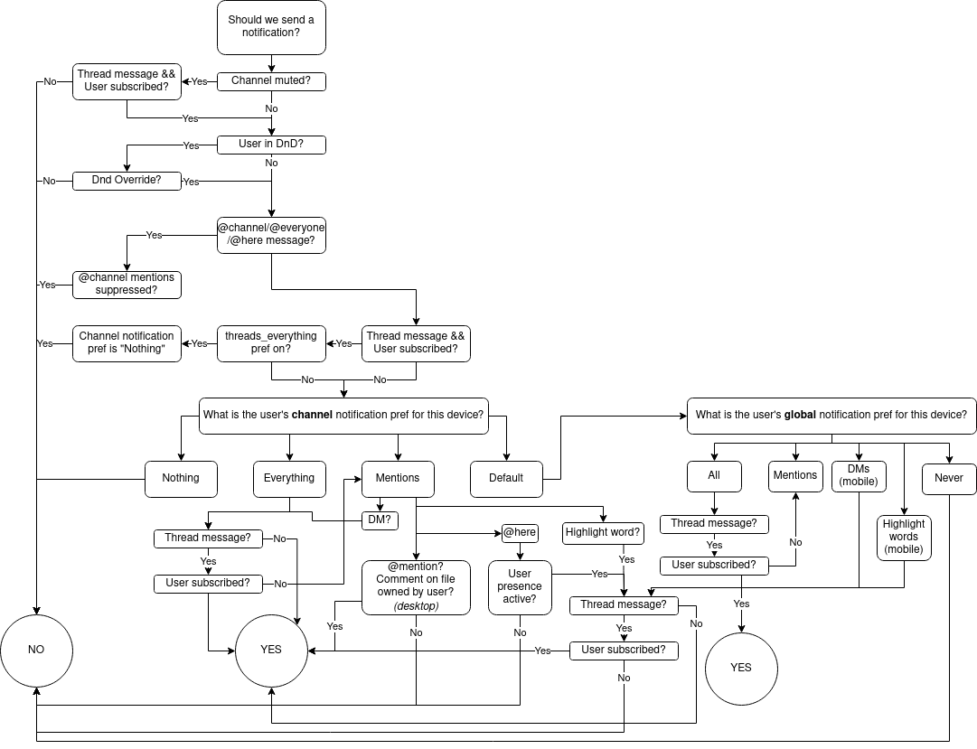
First, we re-draw the diagram with the intent of capturing the same logic, but in an editable diagram that will show the future simplifications:

Slack’s diagram is effectively a representation of propositional logic; discrete values that can be combined logically (and, or, not, …). Focusing on the bottom of the figure, we can create a table of the variables:
| Var | Definition |
|---|---|
| A | Channel notification pref is “Nothing” |
| B | Channel notification pref is “Everything” |
| C | Channel notification pref is “Mentions” |
| D | Channel notification pref is “Default” |
| E | Global notification pref is “Never” |
| F | Global notification pref is “All” |
| G | Global notification pref is “Mentions” |
| H | Device is Mobile3 |
| J | Message is a @here |
| K | Message is a direct message (DM) |
| L | Message is a @mention |
| M | Message is a highlight word |
| N | Message is a comment on a file |
| P | User presence active? |
| Q | Thread message? |
| R | User subscribed? |
Variables A through C and E through G are exclusionary; the preference can only be in one of the states. Furthermore, the logic only cares about global notification preferences if channel notification preferences are set to “Default”. Since messages can contain content that matches multiple forms (e.g. a direct message can also mention a name, include a term that the user has chosen as a highlighted word, and be a comment on a file), J through N are not exclusionary variables. However, this suggests we can simplify by creating “functions” that encapsulate repeated logic:
| Var | Definition | Note |
|---|---|---|
| T | not Q or (Q and R) | User has not unsubscribed from thread |
| X | A or (D and E) | Unified preference is “Do not notify” |
| Y | B or (D and F) | Unified preference is “Always notify” |
| Z | C or (D and G) | Unified preference is “Mentions” |
With our functions and the nine non-preference variables at the bottom of the diagram, we have 13 variables. This is too many variables for a Karnaugh Map, which is our usual go-to means to simplify logic. However, we can visually trace through the preference logic. The “Everything/All” and “Nothing/Never” paths are easy to verify as equivalent. The “Mentions” paths are unfortunately harder to follow.
“Mentions” is where the concurrent states allowed by the diagram’s language complicate things, because we want to equate a channel preference for Mentions to the global preference of Mentions, but the Global logic elevates direct mentions and highlight words as parallel choices to the preference value.
A likely error in the figure is the “Highlight Words (mobile)” path under the Global notification pref. The next block in the path checks for either @mention or a highlighted word, and will then trigger a notification if T is true. However, since there is a parallel path under Global notification for Mentions, and that path will trigger a @mention regardless of the value of T, this implies unnecessary checks if a message contains both an @mention and a highlighted word. Removing the @mention line eliminates an unnecessary complication on the mobile side.
With that, we want to prove that:
channel notification pref set to Mentions and at least one of:
	K and T
	L or N
	J and P
	M and T
is equivalent to:
channel notification pref set to Default and at least one of:
	G and ((M and T) or (J and P) or (L or N))
	H and K and T
	H and M and T
The Mentions logic aligns except for direct messages. If the channel notification pref is set to Mentions, a direct message will notify as long as T is also true. However, if there is no channel preference (so Default), then a direct message on the desktop … is not represented. Since direct messages, based on personal experience, can notify on the desktop, then I’m obliged to suspect another error in the diagram and that “DMs (mobile)” is really just “DMs”.
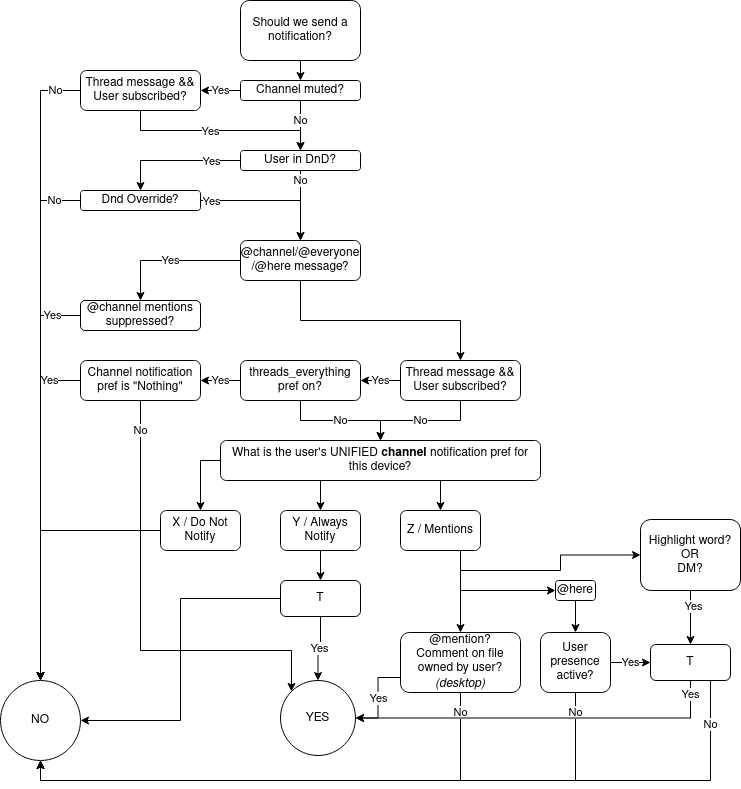
With these corrections and simplifications, we can present an updated diagram as:

Alternatively, we could represent this logic (again focusing on the bottom) in pseudo-logic or code. Decision logic often represents well using pattern matching, so I present an alternate representation:
case X => False
case Y => T
case Z if highlight word or direct message => T
case Z if @here => user presence active and T
case Z => @mention or (desktop device and comment on file)
Diagrams for Requirements
In general, I’m a fan of visual languages to describe activities and interactions. I’m less of a fan for using diagrams to convey structure in software (e.g. UML class diagrams, entity relationship diagrams) or decision logic because these tend to become eye charts. When representing decisions visually, keep these factors in mind:
-
Flowcharts/decision trees impose precedence. The diagram language states that you check one factor before following a branch to check another. In contrast, the reading order of symbolic logic is understood as not imposing precedence, unless parentheses are used. Sometimes the order matters and sometimes it is arbitrary. I have seen diagrams created that show the optimal order of checks (based on the cost of making them), but often it is meaningless. Implementers of the logic need to understand if the diagram’s order is intentional or not.
-
Unless the diagram allows hierarchy or authors are willing to place complex checks into a node, repeated logic may appear within the diagram. This can lead to duplicative code which increases the risk of bugs and increases the cost of change.
-
If someone wanted 100% coverage for the decision logic, they could face writing ((2^19)) (or more) tests, depending on how they assign variables. If they just follow the diagram so as to eliminate all the don’t care states, they will need to trace through the diagram over and over. Since the diagram does not follow a formal representation, there are no tools to aid in processing or translating the logic. In contrast, if this was built from a library of test cases or a formal representation (e.g. a programming language), the authors could leverage software tools.
-
Since the publication in 2017, Slack has shifted the data model from channels of various types to a single model of conversations. ↩︎
-
In the @here path, if the user presence is not active, the @here path will resolve to no. In the highlighted word path, if the message is not threaded or the message is threaded and the user is subscribed, this will resolve to yes. ↩︎
-
We are modeling device types as H=1 meaning mobile and H=0 meaning desktop. The diagram only provides for the two states, but this may not be a good forward-looking modeling choice. ↩︎